Want to read this in iBooks? Get an ePub of this article here and use this shortcut to extract from the .zip.
iPad users who have been holding out hope for an update to Reeder for iOS can relax – a new version was released today with full support for all devices on all platforms and some interesting new features.
See, previously, Reeder 3 wasn’t updated for the new iPad Pro models – after 7 months without proper support in sight, many iOS power users like me sought out new RSS readers. And while apparently Reeder 3 had resolved layout issues a month ago, I had honestly already deleted it since it didn’t work on half my devices.
But that all changes today with the latest release of Reeder 4.
Available as a new purchase costing $4.99 on the App Store and $9.99 on the Mac App Store, bringing with it a refreshed design, some unique reading features, and a unified code base across iOS and Mac that will make it easier to update in the future.
I bought the app as soon as I heard about it this morning – here’s why I think my money was well-spent.
Table of contents
- Why I like Reeder
- The Many Views of Reeder
- Styling
- Customization and control
- New features
- Redesigned
- Bionic Reading
- Instapaper Tags
- Read Later
- Small changes
- Keyboard shortcuts adjustments
- Ideas for expansion
- Conclusion
Why I Like Reeder
In my opinion, Reeder provides the ideal feed reading experience.
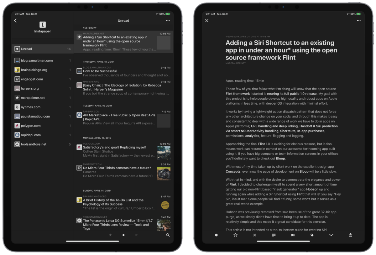
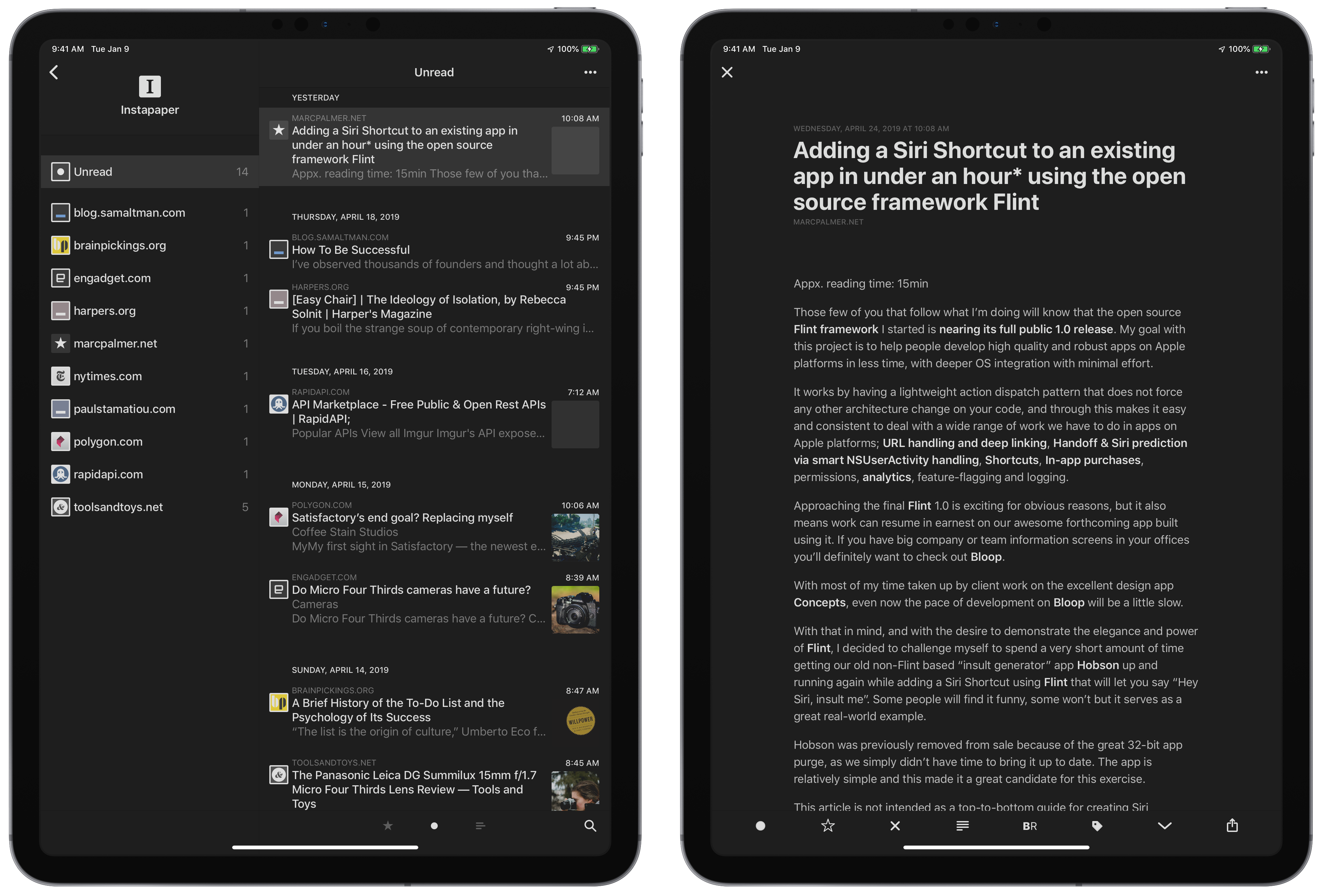
With Reeder, I can easily check the list of articles, swipe one to the right to mark it as read or to the left to save it for later, then read individual articles in a nicely-formatted column.
Plus, Reeder has always had a killer feature for me – rubber-banding between articles once you are at the top or bottom, much like Safari’s Reading List allows.
For me, using Reeder lets me efficiently process my incoming stories, either from the list view or by jumping down through each full story, giving a fantastic flow to the experience.
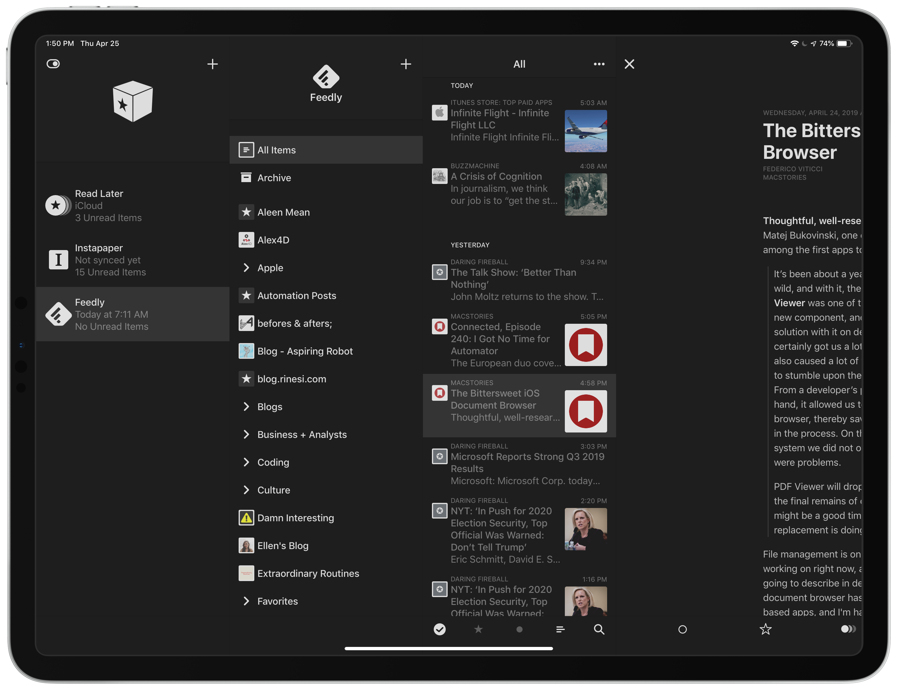
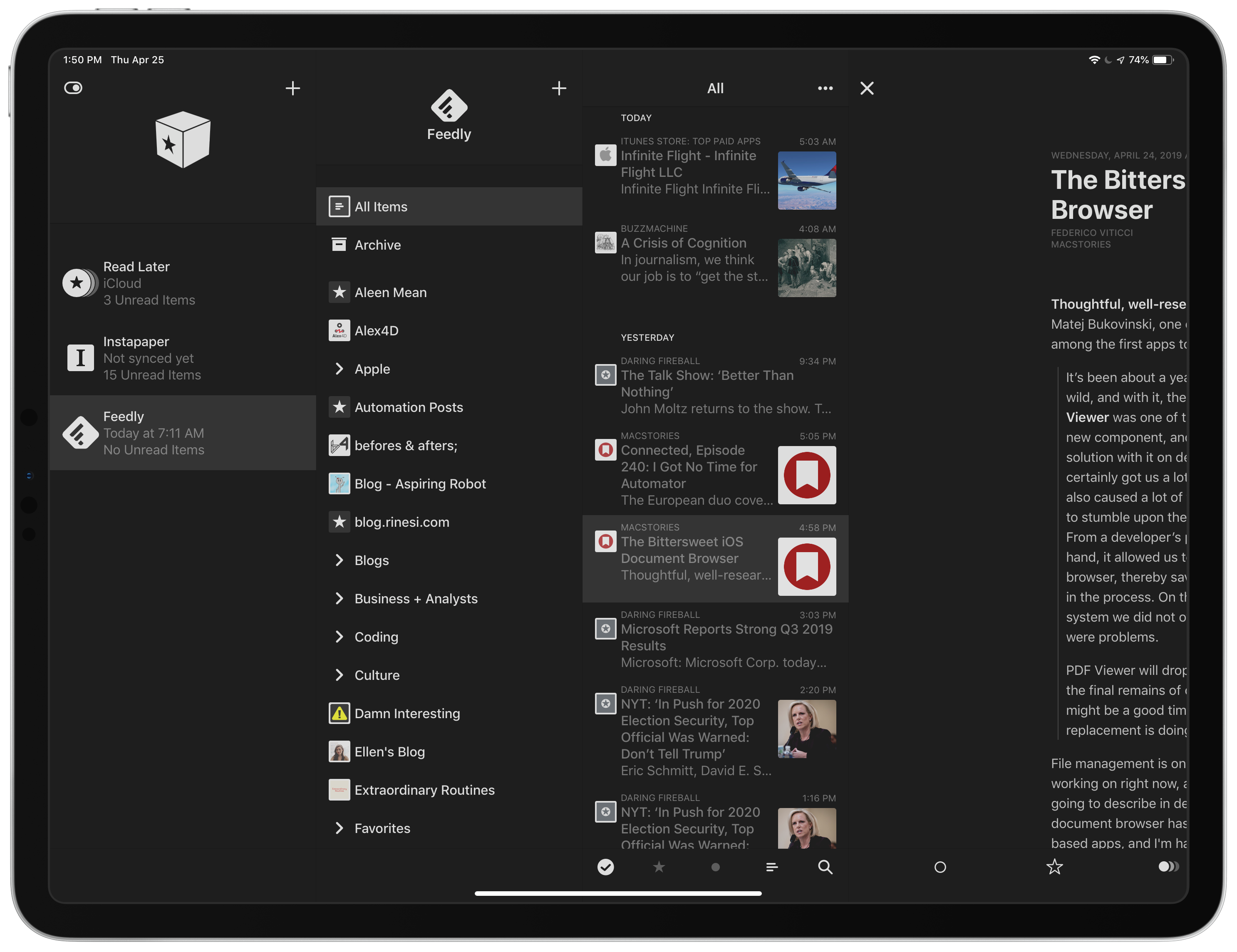
I’ve set it up for my RSS feeds synced via Feedly and articles I’ve saved for later in Instapaper.
There’s support for other services like Feedbin, Feed Wrangler, Feed HQ, NewsBlur, The Old Reader, Inoreader, BazQux Reader, and Fever as well, but I chose a free RSS reader and Instapaper has long been my favorite longform read-it-later application.
Once I’ve saved the stories I want to read, I then jump into the Instapaper view and go through any links I’ve added that don’t necessarily work great as “read it later” articles. Any Amazon links or YouTube videos I will tend to shoot off to Reading List to easily process in Safari, making this fall out into a sort of three-tier system:
- Feedly for incoming feeds
- Instapaper for reading later
- Reading List for non-article links
Then, I usually have a minimal amount of stories to read and I come back to them when I’m ready, either right away in Reeder or later in Instapaper, and with Shortcuts ready to go if I’m in my Reading List in Safari.
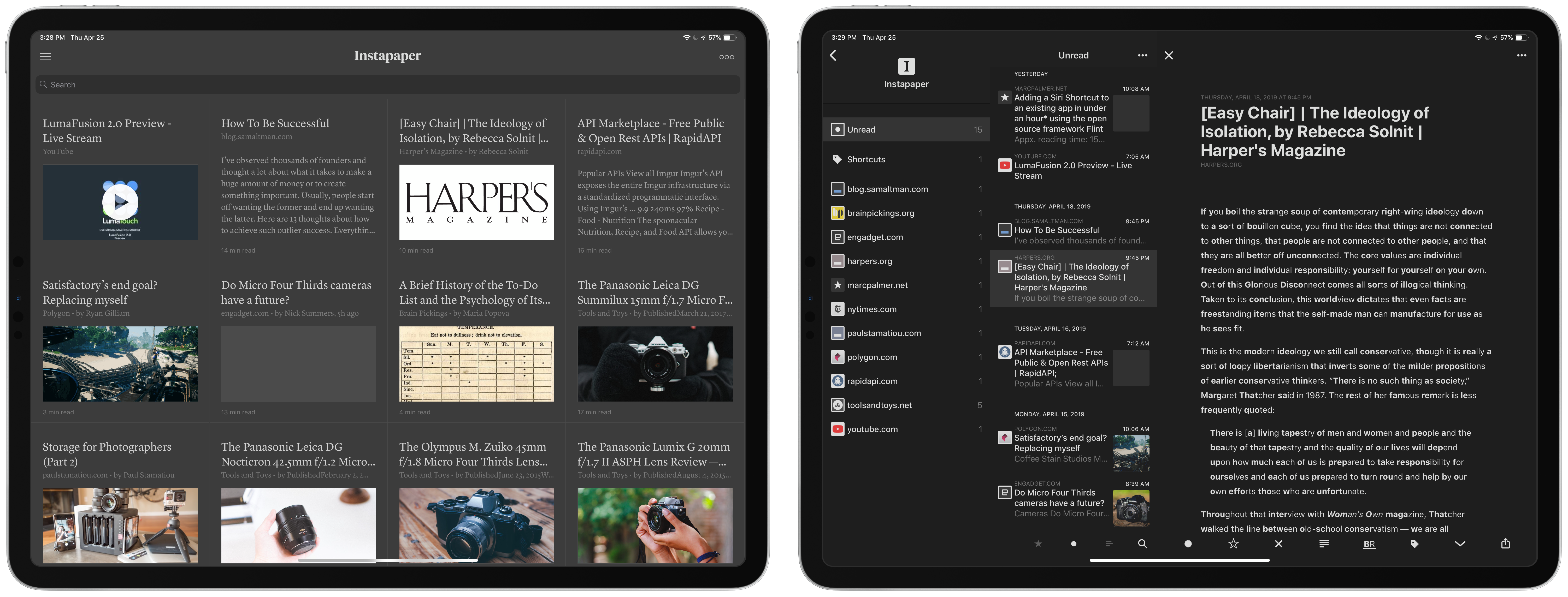
The Many Views of Reeder
For those moments when I have more time to read, Reeder also provides natural ways to view your lists of articles, and novel ways to consume them.
In the Options menu there are also adjustments to the overall appearance that are nice – you can:
- set the theme,
- change all of the favicons for your feeds to grayscale for a more minimal look,
- adjust the size of the Text in the article list (I set mine to Medium),
- choose what size to display image previews, and
- choose whether to dim archived articles in the article list
I chose Dark mode for my iPads and Black for my iPhone XS Max, which looks extra crisp thanks to the OLED screen there. Grayscale favicons for each website source are nice too, but with the newly-added image previews in the article list, I prefer the color version.

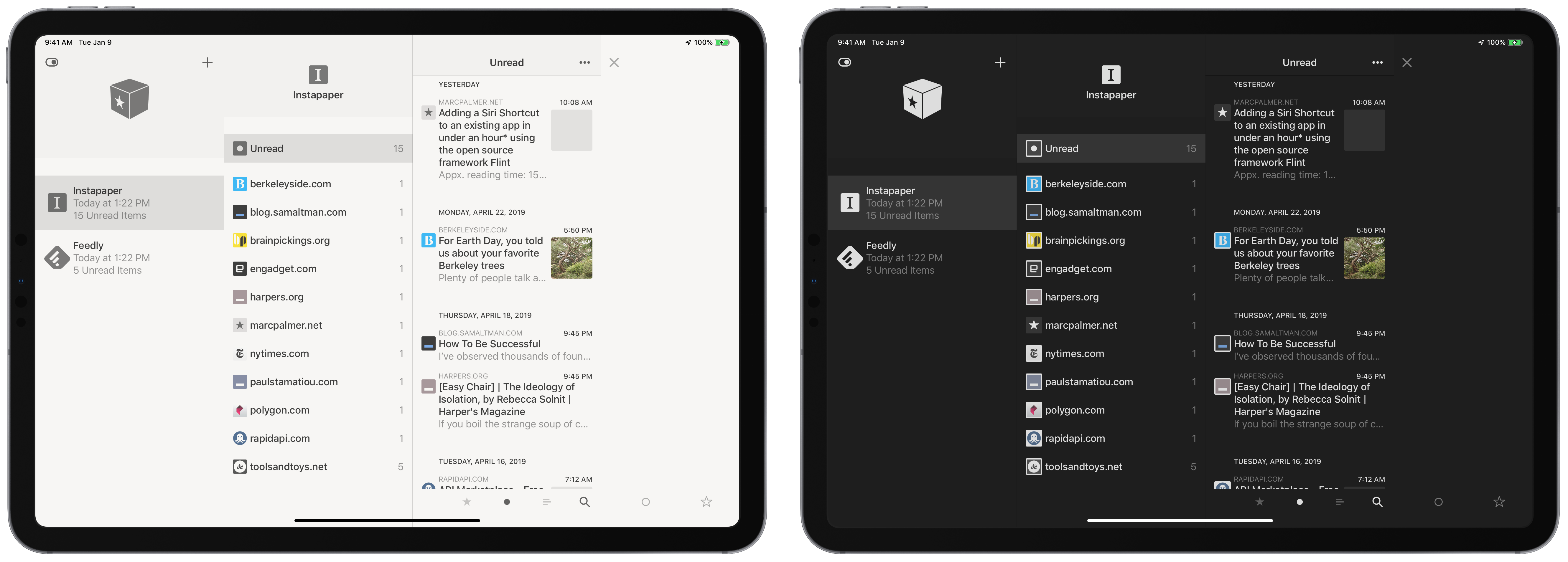
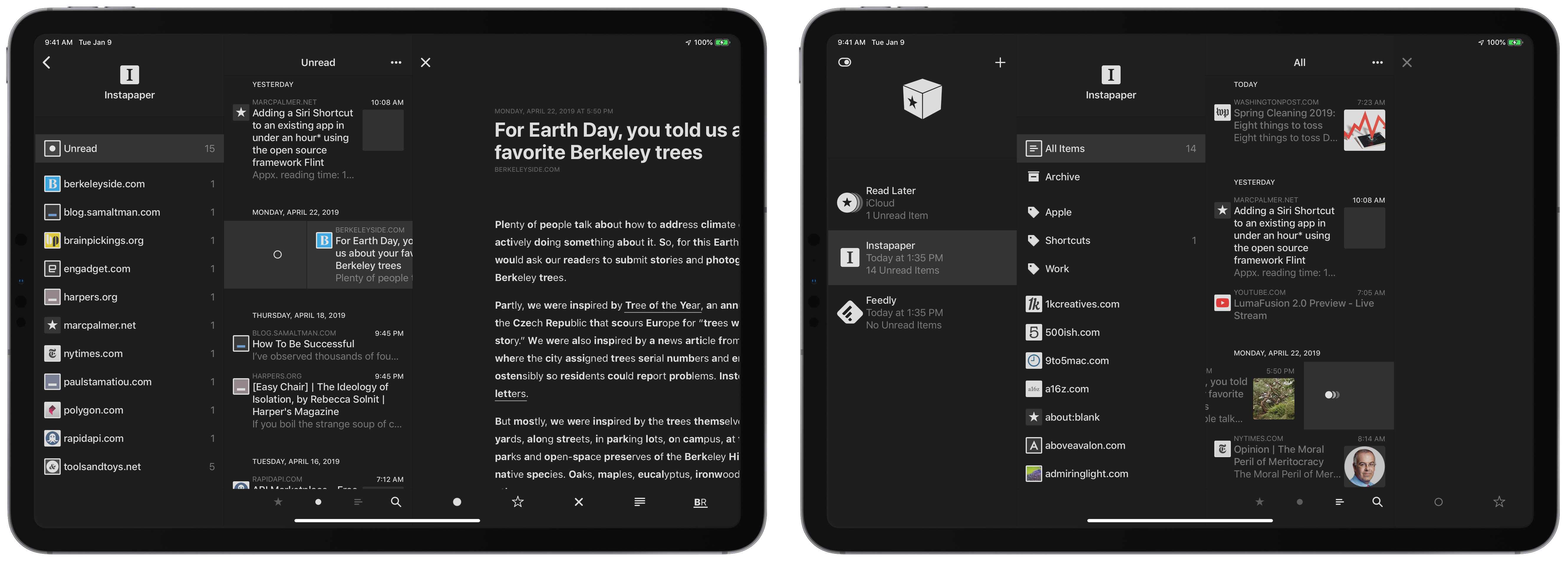
The main Appearance feature for iPad and Mac users to consider, however, is their Preferred layout, which comes as Automatic, Single, Compact, Regular, and Full.
By default the app will automatically choose which mode to use depending on how much screen space is available – in landscape full screen, tapping a service will show All Items, Archive, Tags/Folders, and the list of individual sources underneath. Tapping one of those options will show the article list on the left and, when selected, an article on the right.
Pulling the whole article by swiping right can also expand the other two layers of sidebar back into view, and swiping to the left again instead expands the “Show in browser view”.
Alternately, turning the iPad into Portrait or combining a 2/3 landscape view with a 1/3 split view app will change the arrangement – sources and articles are shown, then the article is only in fullscreen.
And finally, in half-view on both iPad Pros, Reeder adopts a single column-mode like the iPhone version with one view per screen.
Overall, this variability is nice – I don’t recommend choosing an individual behavior because you’ll inevitability run into a moment where you want to change it.
And, just for reference, he’s what the other views look like (“Regular” is what Automatic most often displays as):
- Single: one item per view

- Compact: condenses views and displays articles fullscreen

- Full: always shows the whole sidebar, plus the articles list in browser mode

From my testing of all of these, I do prefer Automatic, but there’s also two improvements that’d make it perfect:
- Full-screen for iPad: I noticed there’s no way to simply view a full article with no sidebar in the default iPad view when in landscape when using Automatic layout.

Getting rid of the sidebar here would make this view perfect. It’s safe to assume I want to use the sidebar, but not being able to hide it at all is unfortunate – if I want to hide the article list, I’d have to pick up and rotate my iPad or pair it with a 1/3 view split screen app.
- Proper split view on the big iPad: Reeder also doesn’t take advantage of the “two fullscreen iPad apps side by side” of the 12.9″ iPad.

The iPad Pro should display two full-sized apps side by side, not condense one of the apps to a lesser view. This view shows a single column view as if there is limited space, when it should use the combined Sources/Article list view like in the fully expanded view instead. Having two full iPad apps is one the key differentiating features of the larger iPad and implementing this choice for Automatic view doesn’t fulfill the benefit promised to users buying this device.
I’d like to see the Automatic view changed in a future update to support both of these features – it’s really good and so so close, but definitely noticeable if you’re all-in on iPad.
Styling
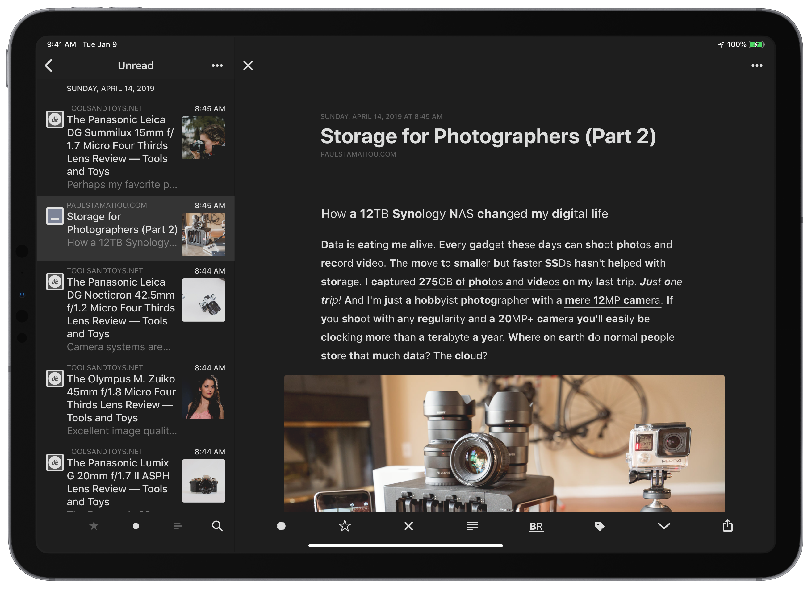
Beyond those views, the minimal iconography and simple way Reeder styles the text makes the reading experience excellent out of the box, no jank in sight.
The app includes mulitude options for making a reading layout just the way you like it, which I find to have just the right mix of typographic choices and control without letting me turn it into some ugly beast.
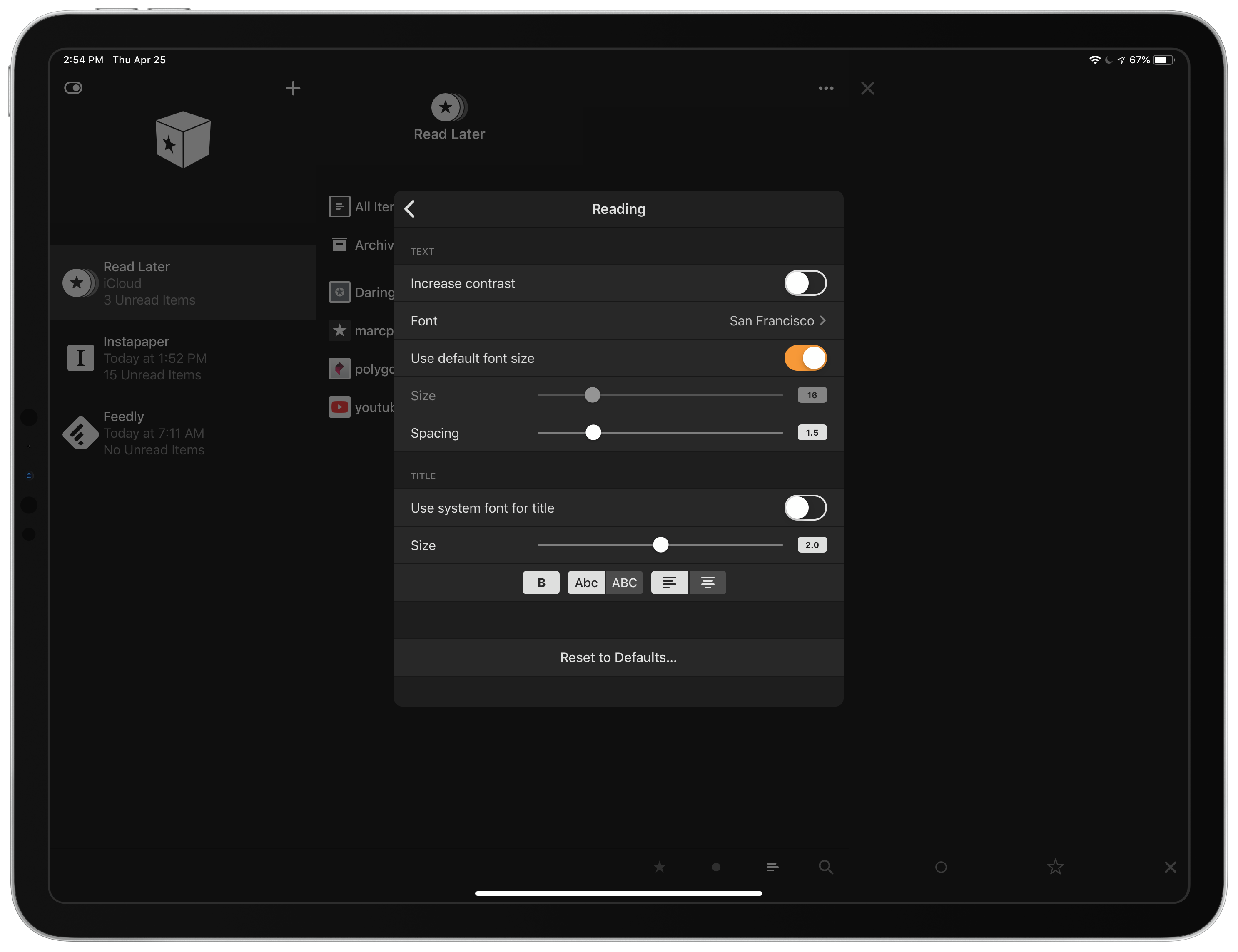
For articles, these are the options:
- “Increase contrast” by converting links from bolded to underlined,
- font choices (although the default San Francisco looks gorgeous with the Dark Theme),
- the ability to change text size, spacing, and the title size, and
- more title customizations like bolding, title case or all capitalized, and left- or centered-alignment.
I don’t even feel the need to change these, since it seems just right for me.
Customization and control
Once you’ve added services, be sure to poke around with the Settings screen to get things just right too.
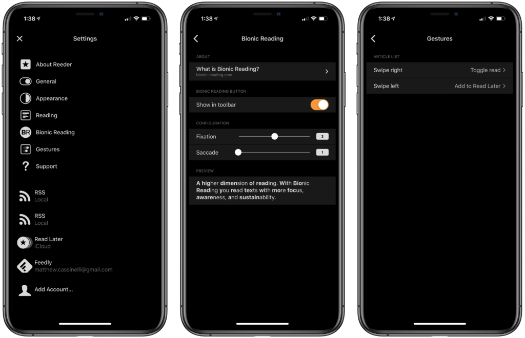
The Settings screen also lets you adjust the Bionic Reading settings and read more about that if you’re interested, plus there’s a Gestures menu for toggling the swipes on the article list.
These gestures are super personal as well, with options to Toggle read, Toggle starred, Add to Instapaper, Share, or trigger the Action sheet (which is Unread, Starred, and Share in one) – choosing which one on which side depends on your needs, and also takes some trial and error.
“Swipe right” is the action of sliding it to the right but revealing the iconography on the left, and Swipe Left pulls it left but shows the icon on the right.
This also confused me inside Instapaper, because my setting for Swipe Right to add to Instapaper just doesn’t work as it can’t save it to itself again, but instead activates the overall “Swipe on the article to open browser view”.
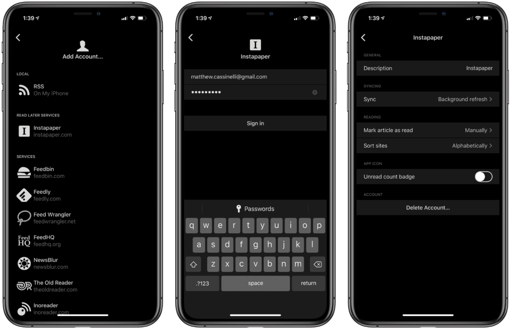
In the Settings screen, you can also tap on individual Accounts to adjust the settings for each. Here you can:
- change the Description to show a different label in the sidebar,
- change syncing between On Start, Manually, and Background Refresh,
- choose whether to “Mark article as read” either manually or “on open”,
- sort the sites by Alphabetical order or by unread count, and
- choose whether each source’s unread count will show on the app icon badge
I set all of mine to refresh in the background, mark my articles as read in Instapaper and upon open in Feedly, story alphabetically, and then turn off all badges (although I may experiment with this).
New features
What’s great about Reeder 4 has also been true of the past few versions of the app – so why is it still worth picking up the new version?
Redesigned from the ground up
As mentioned in the App Store update notes, the app has been rebuilt to share a codebase across iOS and macOS, making it easier to maintain and update in the future.
This accounts for the delay in the release, and it shows through in the unified look and feel across platforms.
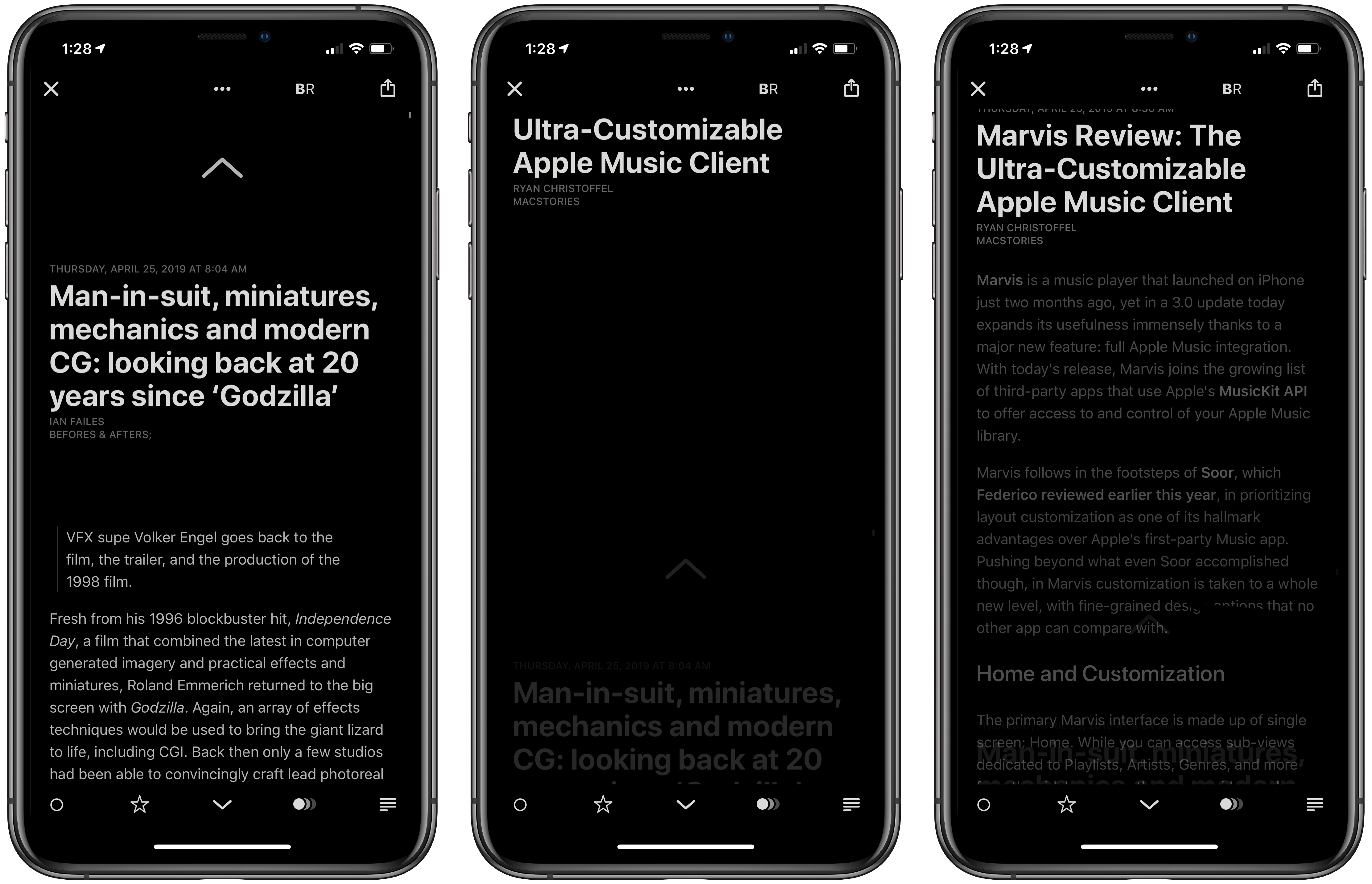
Bionic Reading
The more interesting and novel feature added in Reeder 4 is “Bionic Reading” mode, which is an excessive marketing name from another party for a new way of reading that involves the science of memory chunking.
With Bionic Reading active, the first few letters of every word are bolded to attract the eye’s attention and letting your brain fill in the rest of the word.
This works because, when you read, you only physically look at the chunked letters and then your eyes/brain/magic combine it all for you. Reading this way lets you mentally complete the word and move on to the next chunk immediately.
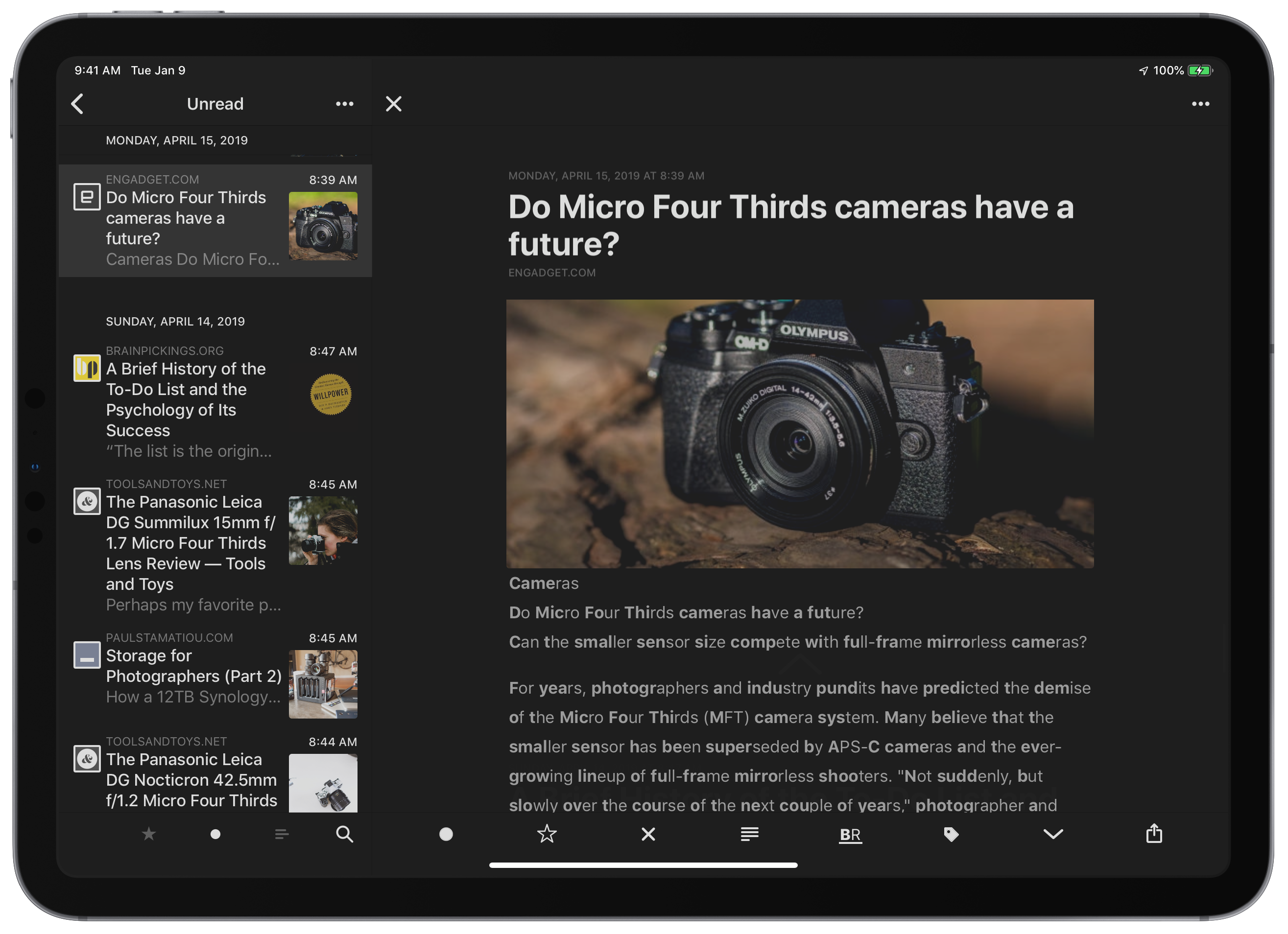
Much like it’s easier to read 510-936-1532 than it is to read 5109361532, bionic reading works surprisingly well too.
I suggest you at least try it out for the novelty, but I will have to see for myself in the long run how it pans out as a daily tool.
Instapaper folders as “Tags”
Instapaper in Reeder also gained new features in version 4 – previously the app had no way to let you organize pieces into Instapaper’s folders, but now you can use “Tags” to an individual article to a folder.
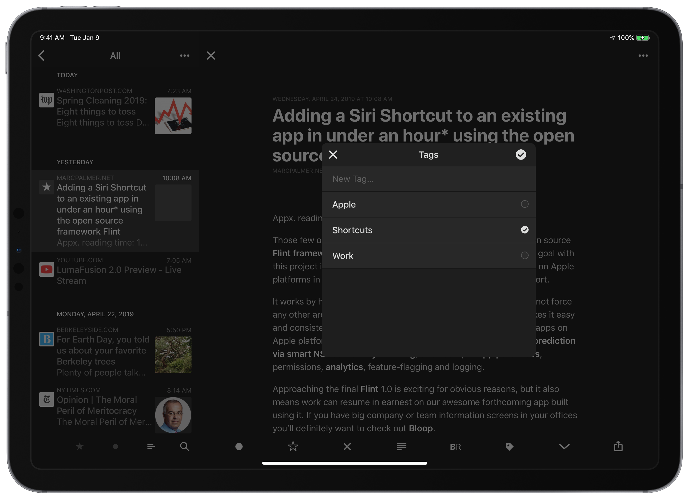
Adding a new tag will create a new folder, and the list only allows you to use one – this is slightly confusing because it mixes the 1:many metaphor of tagging with the 1:1 structure of Folders, but I don’t really care – at least we can organize for Instapaper now from within Reeder itself instead of switching back and forth.
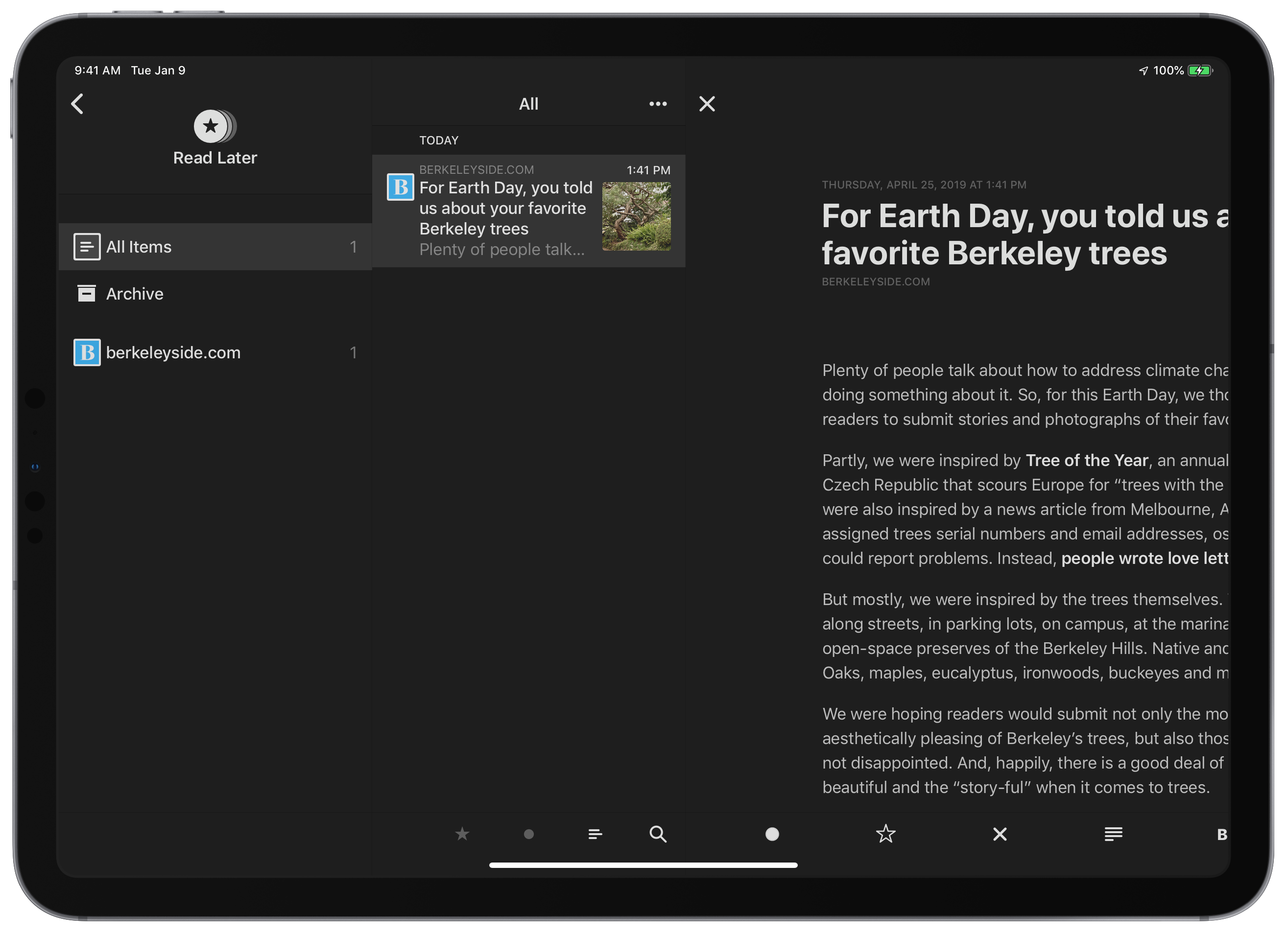
Read Later
The marquee feature new to Reeder 4, however, is a Read Later feature built into the application, which lets you save articles to star and archive within Reeder itself. Sharing articles from another Account now shows a Send to Read Later option in the Share sheet, which adds it to your inbox for when you’re ready for it.
You can also set up gestures so that you could swipe on any article in the preview list and save it for later right away.
However, the initial version feels slightly limited.
For one, there’s no sort of organization like Instapaper or something else like Pocket can provide – folders or tags might help for power users, the type of person who’ll be buying a paid RSS reader front-end anyway.
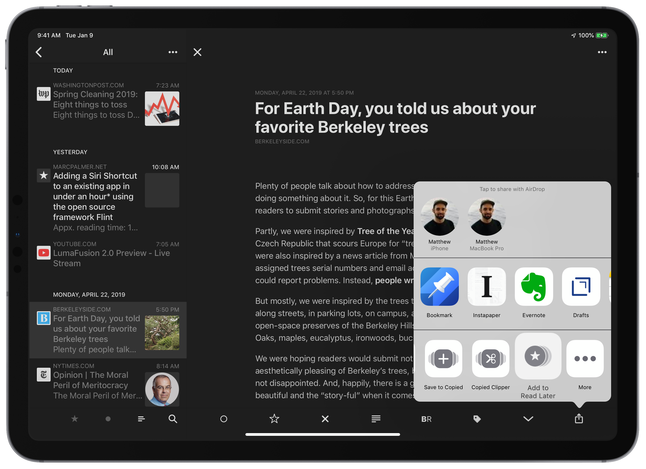
In addition, you can only add articles to the Reading List if they come through an RSS feed first or get saved into Instapaper and then moved in. There’s a Share sheet within the app, but there’s no option to share an article from another app like Safari.
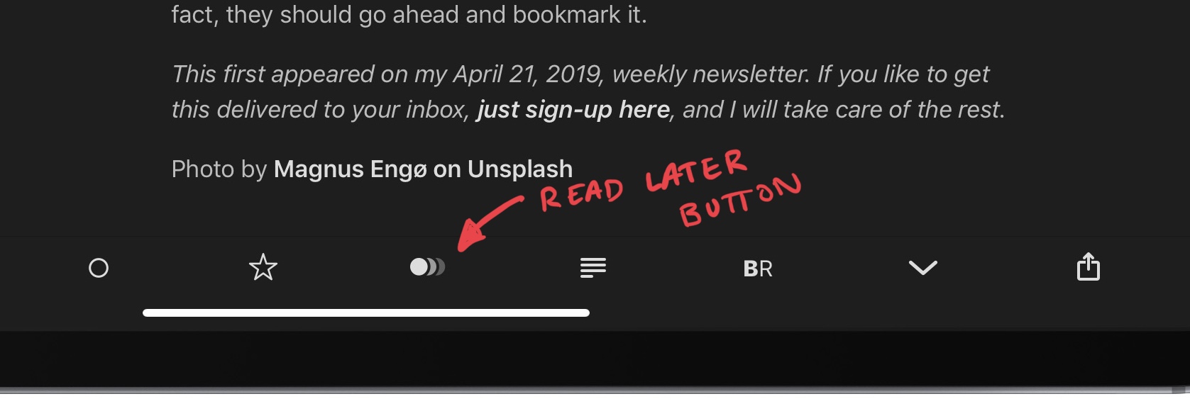
You can also set Read Later as a gesture or use the icon (three overlapping dots) in the tab bar, but with something that worked from the normal Share sheet in other apps, I could come across links in places like Twitter and save them into Reeder – it could be a true read-it-later app.
But without that, I’m not sure if it’s worth the extra step – moving through Instapaper anyway means I might as well keep things there, which is also accessible from the web (and has its own additional features).
I also wish there was a URL scheme like reeder://add?link= that let users pass articles into the Read Later service on their own – I can definitely think of a multitude of ways I could integrate Reeder into my custom shortcuts in the Shortcuts app.
However, Read Later could prove to be useful – I’ll have to experiment with it more. At least for now, with cross-Apple device synchronization to places like your iPhone, iPad, or Mac, this is a fairly good alternative for anyone who doesn’t use Instapaper or doesn’t want to use Safari Reading List.
Small changes to the app
There’s also a handful of things that are tweaked that differentiate Reeder 4 from the past versions:
- Refreshed icon and animated logo:
Reeder 4 has a refreshed app icon that now has slices of gray gradients through it.This also pairs nicely with one slick thing new – pull to refresh also rotates the app logo in a very satisfying way. - Tab bar: Some other small details have changed in Reeder. Now, the bottom bar has new options, letting you toggle Read, Starred, toggle Reading, toggle Bionic Reading, navigate Next, and Share. Plus, when you’re in Instapaper, you’re able to apply Tags. This view lost the “Previous” up arrow, although you can still swipe down to rubber-band to the next piece.
- Custom Share sheet is gone: Reeder has also abandoned their custom Sharing menu, which I am all for – it only allowed certain services to integrate, and required an additional tap to bring up the standard Share sheet.

The custom share sheet, while nice to have initially, is finally gone – no more extra taps. For a Shortcuts power users like myself, I often found myself tapping extra times on a regular basis, so this adoption of the iOS standard is welcome because it makes shooting articles off through my shortcuts that much quicker.
- Reader Mode: There’s also an improved Reader Mode than you can activate that cleans up the article even further.

The Reading Mode makes the already-cleaned up article even cleaner? I don’t know… To be honest I had to look for a bit to figure out what changed, but it appears it strips the date you saved the piece out of the title bar area, pulls in some more of the HTML from webpages like Polygon, and also cuts out aside boxes. Depending on the article/website’s individual formatting, it may also remove some images, but this was inconsistent across sites.
- Instapaper login fix: One minor change is welcome for me – Reeder 3 always prompted me to enter my Instapaper “username” according to the text field label, but it would always fail unless I entered my email address for that username instead. This was a minor thing, but I almost always tried to remember it, chose wrong, and ran into it enough that I immediately noticed it was fixed in Reeder 4.
Keyboard Shortcuts adjustments
Reeder also offers a fantastic bunch of keyboard shortcuts to the app that iPad users can take advantage of and now align with those on the Mac version.
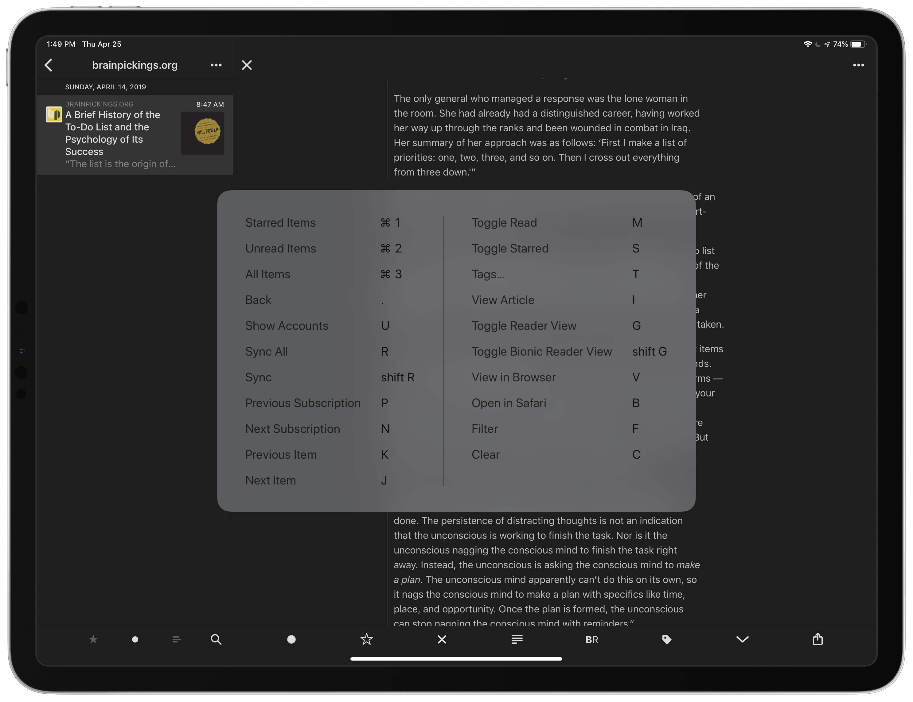
Article List
Command + 1,Command + 2, andCommand + 3switch the article view between Starred, Unread, and AllUtakes you back to the Accounts pageRsyncs everythingShift + Rsyncs just the current AccountNwill take you to the next Subscription/Source in the list andPtakes you back to the Previous,Command + Nlets you add a new subscription (use this whenever you want to add a new blog or site to Feedly)Awill attempt to Mark All As Read (with a confirmation)
Reading mode
Mwill Mark as ReadSwill make the article StarredGwill trigger the Reading mode described earlier, which is also almost imperceptible from the default settingsShift + Gwill turn on Bionic Reading modeIwill then make the app “View Article”, which I’ve only found works if you have selected an article and then have moved back to the view the Accounts (try pressing U, then I)
Browser:
Vwill open the in-app browser from the side using Safari View ControllerBwill open the article directly into the Safari app itself
Search and Clear the list:
Fwill let you add a search filter on the list (which includes full-text search)Cwill clear the list of any archived or read articles
Navigation
jtakes you to the next article andkbrings you to the previous.(period) takes you back up a level, just like swiping can. From an article view, tapping.successively will take you back through Articles, Subscriptions, and Accounts respectively.
On the Mac, it’s also possible to set up keyboard shortcuts for all your available sharing options (plus have them display in the toolbar). Thanks to app extensions, I can use apps like Things and Ulysses seamlessly with Reeder when I’m at my Mac.
These iOS keyboard shortcuts, however, have a few quirks—I think J and K are backwards compared to the Gmail standard—and their usage alongside the Automatic default appearance also confused me a bit:
- Too much view changing:
When the app is in split screen or portrait, there’s no way to navigate the Subscriptions and Articles menu without the app jumping into fullscreen article view and moving through one by one. I’d like to able to navigate through the subscriptions and articles without entering into the individual pieces, then press something like I or Enter to actually select and view the piece. - No sharing shortcuts:
Oddly, there are no keyboard shortcuts for Sharing options – it’d be nice to open the Share menu from the keyboard while viewing an article, but also be able to Save to Read Later and Save to Instapaper from the keyboard where applicable. - Arrow keys gone:
I also found myself naturally trying to use the arrow keys to navigate around, and that isn’t possible either. The app previously included the ability to move back/forward using left/right and next/previous using down/up, but that’s gone in this version – they should copy Instapaper’s.1 - Shortcuts, but not Shortcuts:
One last detail – in the App Store description and in the app, the developer refers to “Shortcuts” but means keyboard shortcuts – there is no Siri Shortcuts support for Reeder.
Ideas for expansion
Aside from the changes that came to the keyboard shortcuts and my suggestions for improving them, I came up with some other features I’d like to see to take Reeder 4 to the next level:
- Customized bar on iOS: All of the sharing features also start to make the iPhone version fairly cramped, especially in lieu of a true full screen text-only mode. Customization could cut down on this clutter too, which is a bit overwhelming combined with true Black on the iPhone X lines and high-contrast white icons.I personally still barely see the benefit of Reader Mode, almost never have any pieces Starred, and might not end up using Bionic Reading – being able to remove those and swap them out for something like “Previous” might be a nice feature for future versions.
- Grid view: I do wish Reeder adopted an alternate Grid view like Instapaper makes available. That’s one of my favorite ways to view an information-dense rich list of my content to consume, and one of the things I sought out while looking for alternatives when Reeder was seemingly no longer being updated in the 7 months it didn’t work properly on my iPads.
- Tagged read later/archive: Adding Tags support for Read Later that exist after the piece is archived would be killer too. Instapaper marks a piece as read and moves it out of its folder and into a generic archive, and Pocket allows tagged archives but just sucks overall – this could make Reeder a proper read later app.
- App icons: Let users customize the app icon from current to classic designs or themed alternates. Reeder has a rich history of unique designs, and it’d be cool to let users change things up if they want.
I think all of the above would be perfect in-app purchases that I wouldn’t mind paying for.
I’d also like to see Siri Shortcuts to open into each of my Accounts or even Feedly folders and Instapaper Tags/folders – chaining deep links into Reeder into my routines would be fantastic.
Plus, as I mentioned earlier, sharing features for Read Later would be fantastic, rather than relying on something coming through RSS or saving it via Instapaper first.
Conclusion
All together, Reeder 4 is a solid update and brings it back into my consideration set of RSS apps thanks to its renewed support and development.
The future of Reeder was unclear for a bit – it may have just been a timing thing – but now I’m confident in using this as my main RSS feed app for three reasons:
- It’s the best-looking feed reading app
I still love the typography and reading options, the keyboard shortcuts and layout appearances are close to perfect, and the rubber-banding from piece to piece is still my preferred style and makes it a must-have to match my Reading List experience that I use for shorter pieces or quick links. - Read-it-later improvements
The addition of Tags for organizing Instapaper pieces into Folders also makes it a more-capable front-end for my longer pieces 2 – now I can save there and organize in either Reeder or Instapaper whatever app fits my fancy in the moment.I am going to play around with the Read Later feature and see how it fits for me – having a Share sheet option and URL scheme would surely help it fit nicely with my Shortcuts setup, if they were to exist. - It’s my all-in-one recommendation
I recommend Reeder to anyone looking to take control of their reading experience, who wants to go straight to their own sources through a curated list of subscriptions, and manage their read-it-later articles, all in one app.
Reeder looks great regardless of device, works well in many setups and layouts, and looks damn good while doing it too.
There’s a few routes I could see the app go down that improve the Read Later and shortcuts experience, but for now I am glad Reeder is back and am happy to give developer Silvio Ricci my money.
Hopefully I can give him more money in the future for new features too – I want Reeder here to stay.
Get Reeder 4:
- It was a slightly odd implementation and didn’t exactly physically navigate but instead combined moving the viewport with swapping to other pieces.I can see why they didn’t include that same version again. ↩
- This is especially relevant since I’ve been moving away from Instapaper Highlights/Notes.Shortcuts lets you have more control and share selected text when run from Safari Web Pages. ↩